This is a look into my year stint in the Type@Cooper Extended Program which consisted of 3 terms: 8 workshops, 60 classes, amazing people, and a sea of type knowledge. I've compiled this for anyone who might have been wondering what I've been up to or why I've been MIA for the past year, or for anyone who might be curious about the program. Enjoy!
TERM 1
Columbia Library
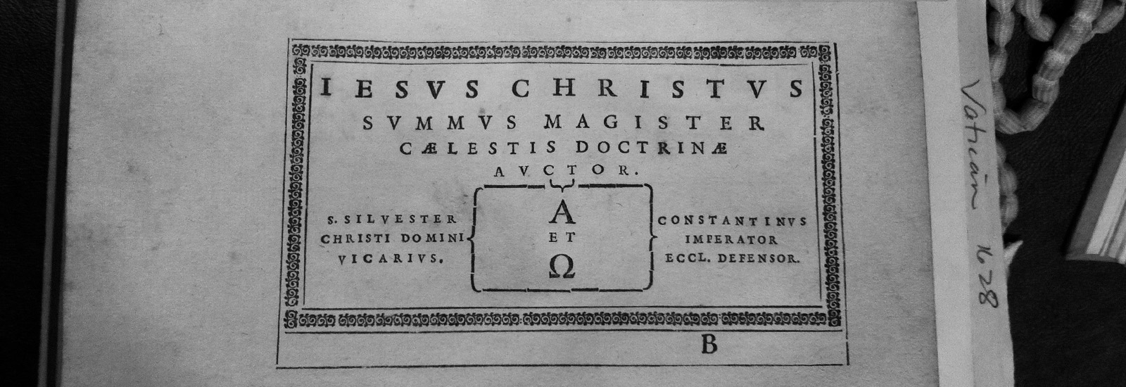
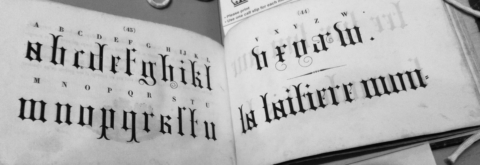
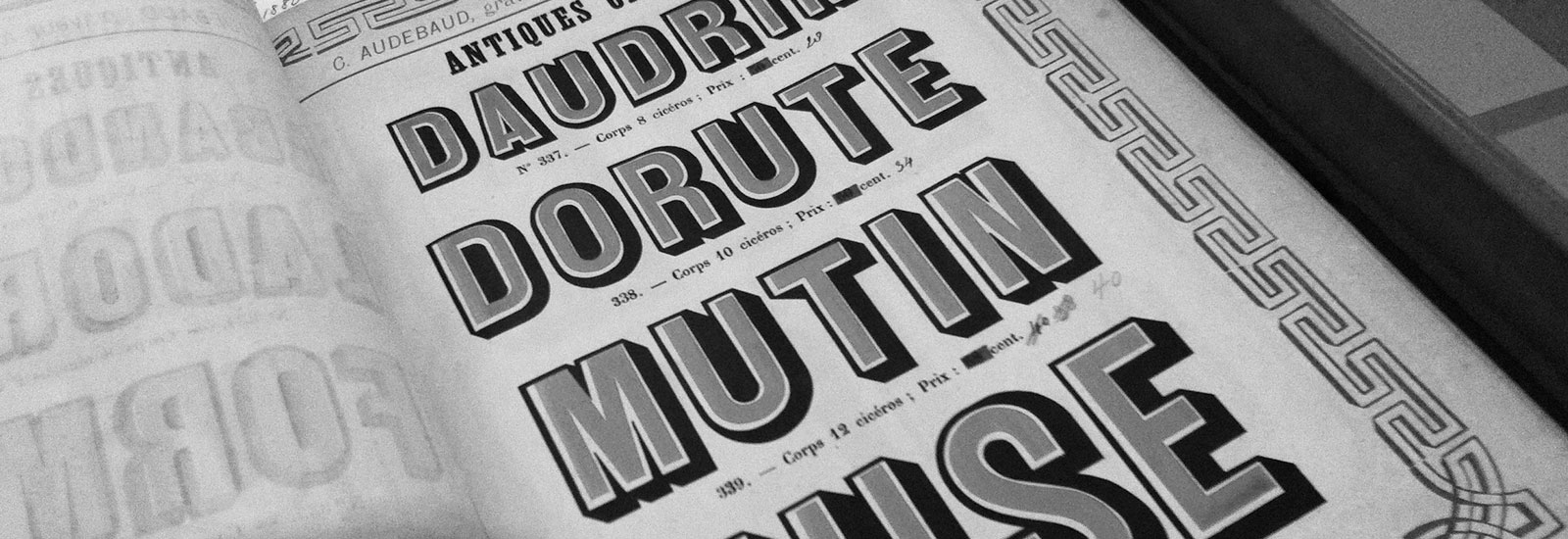
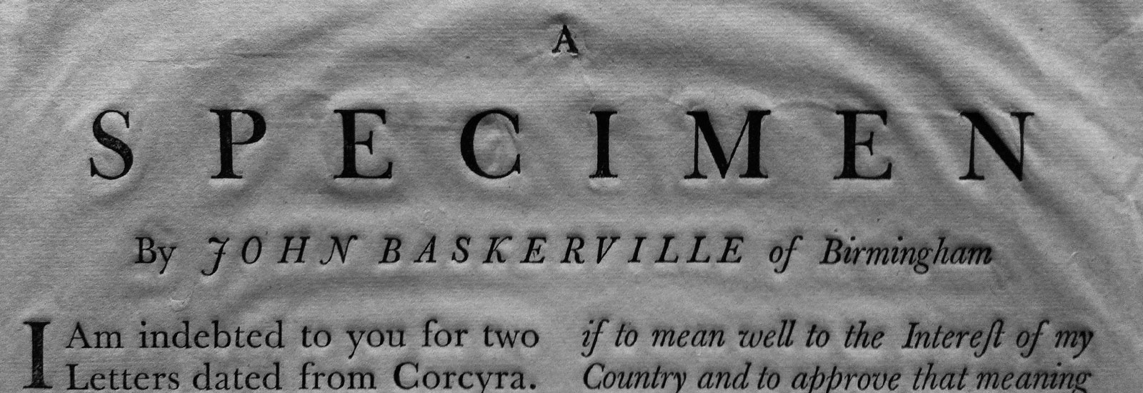
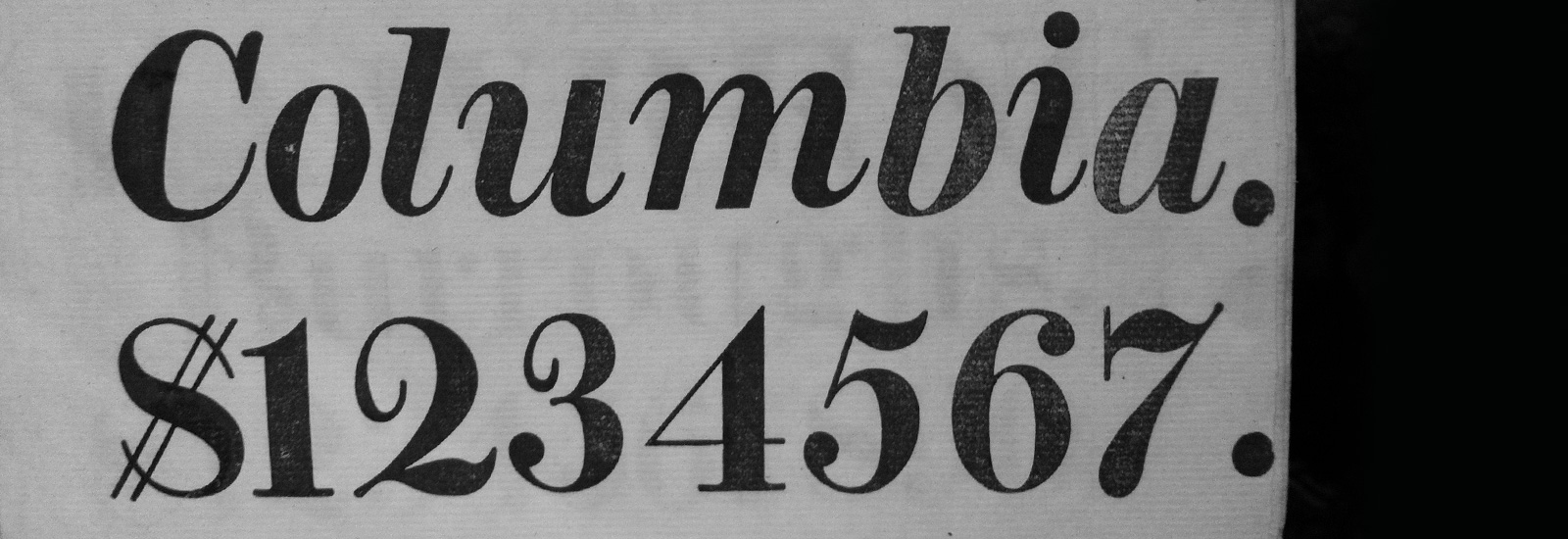
Our first class convened at Columbia University’s Rare Book & Manuscript Library where we were greeted with countless time-honored type specimens. We got to check out some super old books dated from 1628 to 1921 from various type foundries. We were actually able to flip through these books and take photographs, which was a little nerve wracking, but awesome at the same time (for someone who always wants to touch things in museums). I was most impressed by the fact that Columbia owns one of the two existing copies of the first known specimen of Caslon. This was our starting point for finding a historical typeface to revive.
Lettering
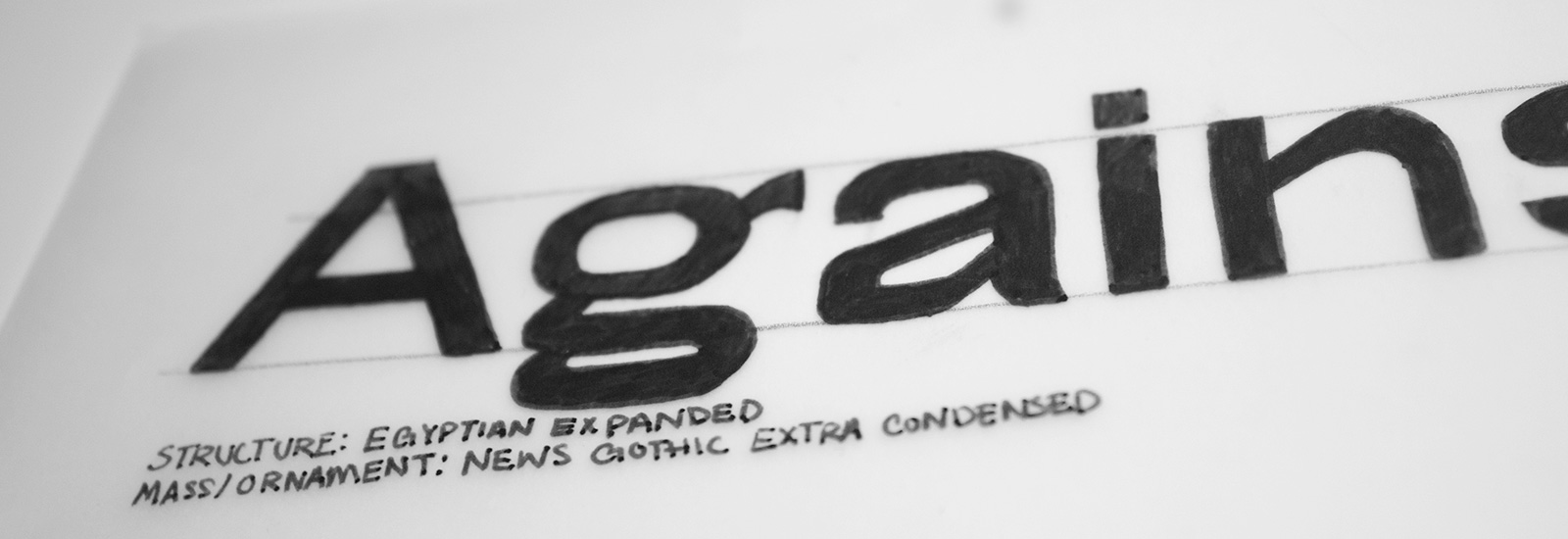
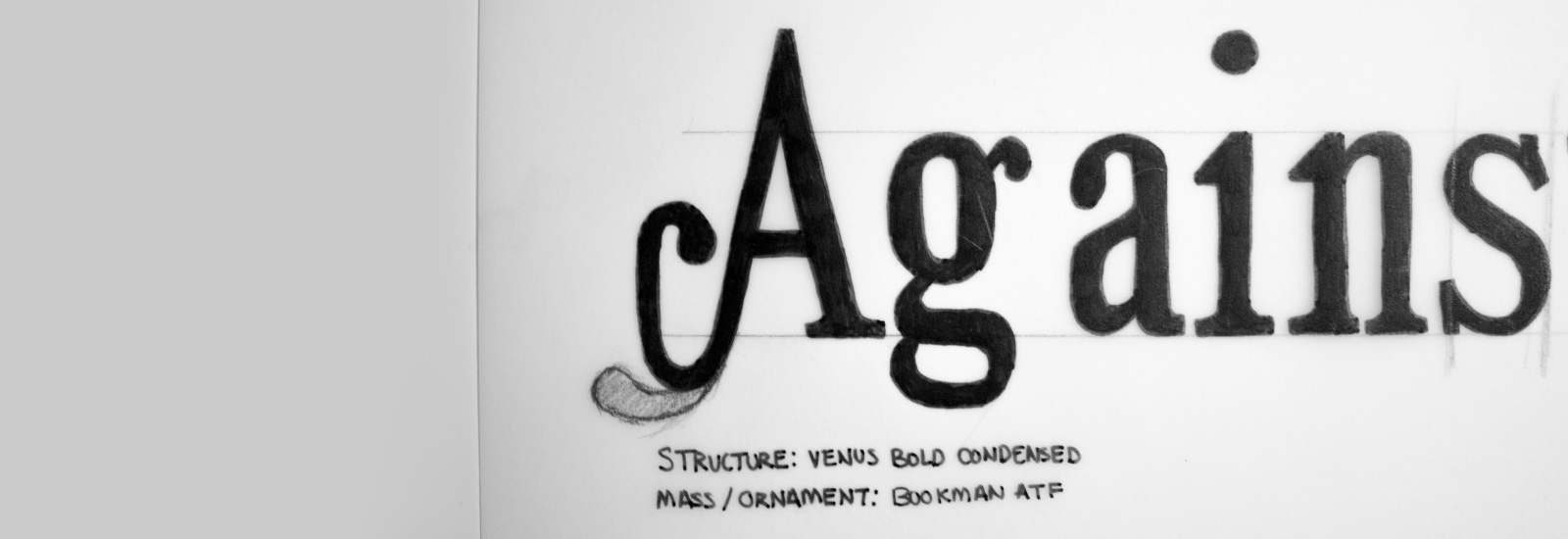
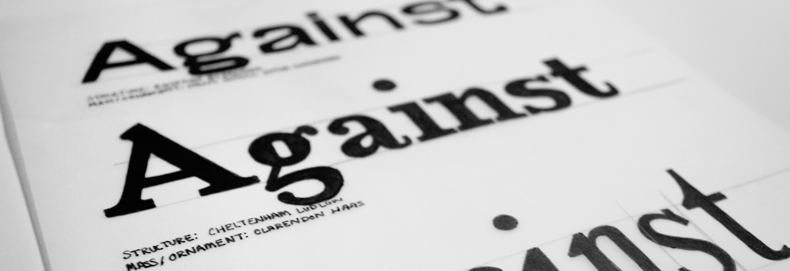
The first assignment was to take the structure from one typeface and combine it with the mass and ornaments from a second typeface. The combination would yield something new and many times pose new problems. We were provided with a list of diverse typefaces and had to come up with our own pairings. For my initial sketches I chose to do mashups of:
Egyptian Expanded & News Gothic Extra Condensed
Cheltenham Ludlow & Clarendon Haas
Venus Bold Condensed & Bookman ATF
Below are my attempts at drawing letters by hand, then digitally in Robofont. Venus Bold Condensed & Bookman ATF combination was the combination I chose to refine and digitize. At the time of completion, I’d say mostly everyone in my class including myself, were pleased with their result, but looking back on this project at the end of the year truly showed how much knowledge and attention to detail was gained. We were all embarrassed to show this project in our final presentations (don’t remind me that I’m sharing this with the internet).

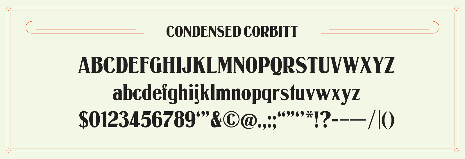
Revival: Condensed Corbitt
While digging around through stacks upon stacks of old type specimens in search of a typeface that was out of copyright (drawn before 1923) and held my interest I found Condensed Corbitt. First off, I’m a sucker for a good condensed typeface; and secondly, the quirkiness of Corbitt’s capital caught my eye. It was love at first sight.
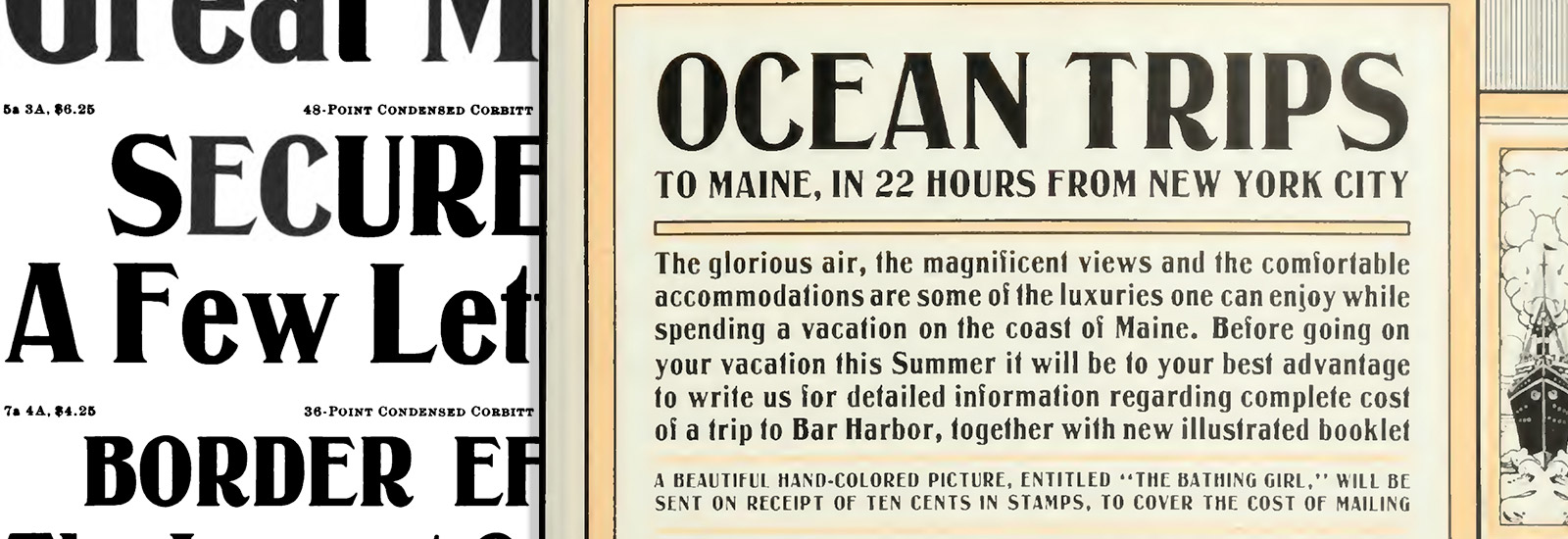
Time for some history: Condensed Corbitt was originally drawn by Nicholas J. Werner and first issued as a metal typeface by The Inland Type Foundry in 1900, then it later showed up in a few ATF (American Type Founders) specimens along with regular and extended styles.
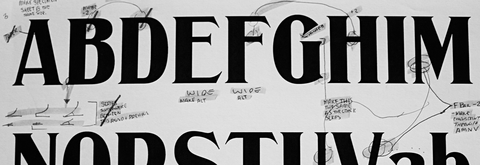
Aside from the specimens I was lucky enough to stumble upon photos of Condensed Corbitt in wood type while hunting around flickr (courtesy of pearcetrip). With the aid of the specimens and wood type photos I was able to find every character, lowercase and capital, along with a few punctuation marks. The biggest challenge with this revival was deciding to draw the ends of the serifs since these varied a bit and were not always clear.
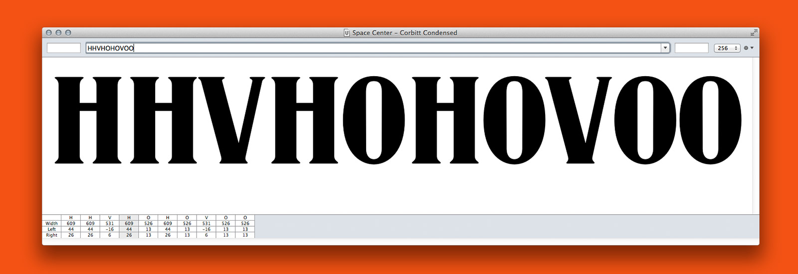
Throughout the drawing process, my goal was to remain as faithful as possible to the original drawings, or try to figure out what Nicholas Werner would have done in some of the less-clear references I had. I made those calls based on discussions he made in similar letterforms. Although I didn’t agree with all of the original drawings, I drew them all as-is then drew alternates for some of the letters that seemed too wide (E,F,S,T,U,s).
It was required that we complete all the lowercase and capital letters. I drew a few of the additional characters I found as well. Mid December was our final crit for this project. It was full of great work, guest critiques by Sumner Stone and Sara Soskolne, and ampersand cookies made by @thekarolina.
Moving forward, I would like to pick this up again and rework some of the drawings. Looking back I did some questionable things in terms of drawing since I was learning how to draw in Robofont, and how do it well. I’d also like to expand the character set through means of searching for additional missing characters, and creating some of the ones I can’t find. Then maybe someday release it… Then maybe revive the other styles I found… Then maybe do some italic styles… In other words: big plans for this one.
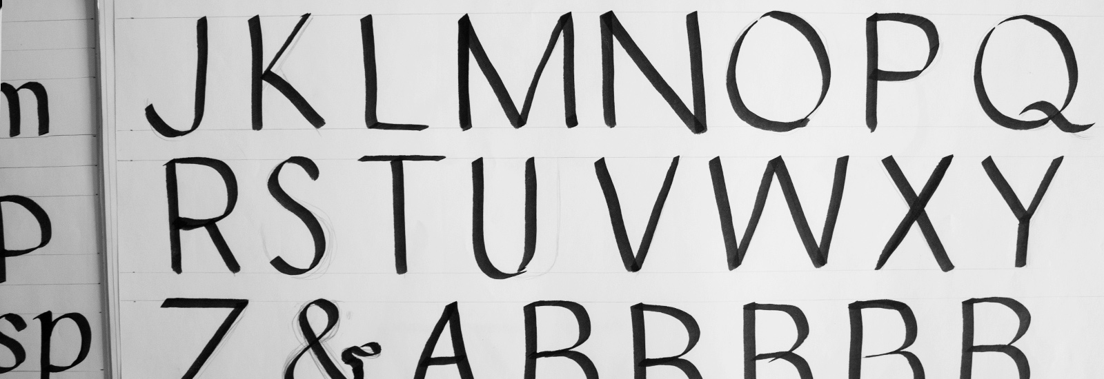
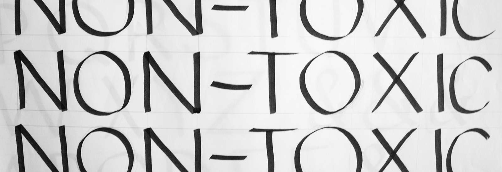
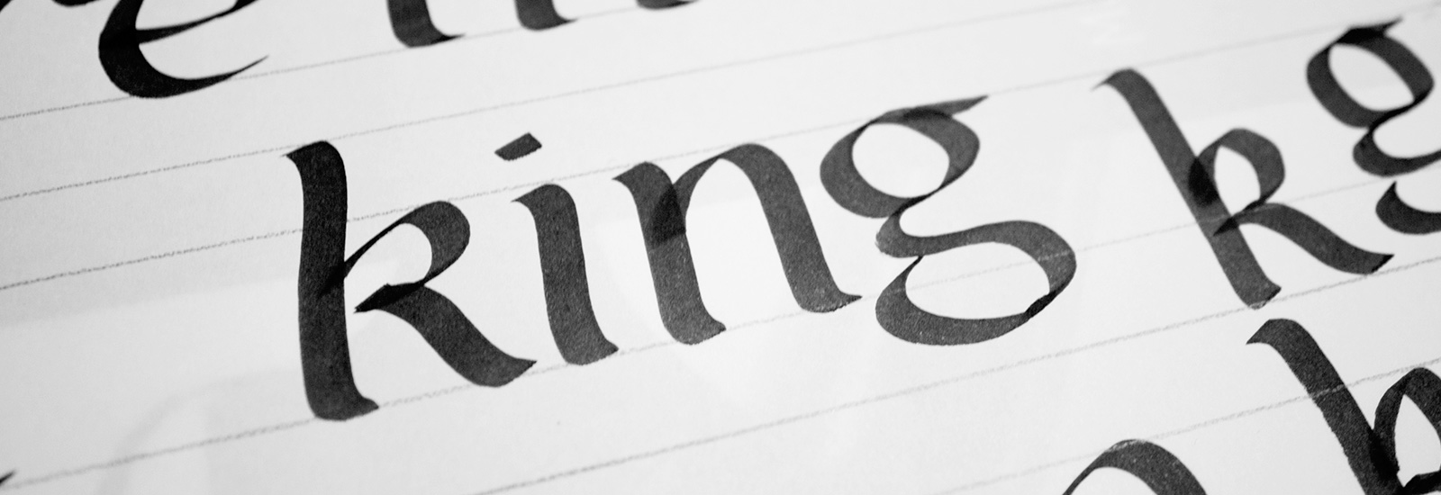
Workshop: Calligraphic Letterforms with Karen Charatan
Karen Charatan is a calligrapher and sign painter.
For two days we practiced putting marker to paper. Before this workshop I had never tried calligraphy. I received a calligraphy book for Christmas one year when I was 8, but I got as far as finding the gold ink in the kit and forgot about the rest of it, but that’s another story. While I might not have been a calligraphy master, I began looking at letters differently. I started to see why letters look the way they do, and much of it has to do with the tool used to construct it (pen, brush, marker, etc…). The angle which you hold the pen and the direction of the stroke all determine the thicks and thins of the letter. In a way the pen does a lot of the thinking for you. Below is a bit of what I practiced in the workshop.
Workshop: Drawn Letters with Ken Barber
Ken Barber is a type designer and letterer at House Industries. He also runs a design resource called Type and Lettering.
Ken Barber’s workshop was awesome. It encompassed everything I love: letters and metal / hardcore. It was great to see Ken’s process and inspiration since not everyone is inspired by death metal lettering and asks if its okay to play Slayer as background music while you’re working. We took a look at some of the work he has done while at House Industries and learned about their process too.
We also did some lettering of our own. I chose to do a round hand script since scripts were off limits for our typeface revival choices. Scripts were also the first thing that came to mind when lettering was mentioned, and I’ve always loved that style of work. The workshop ended in a competition as to who’s lettering was the favorite among the class. It was a close call, but I won by a vote or two. My prize was a sweet House Industries tote.
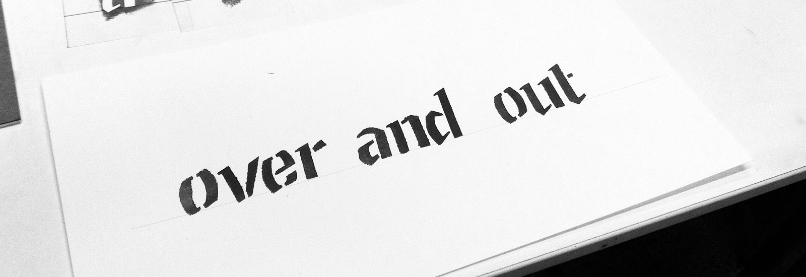
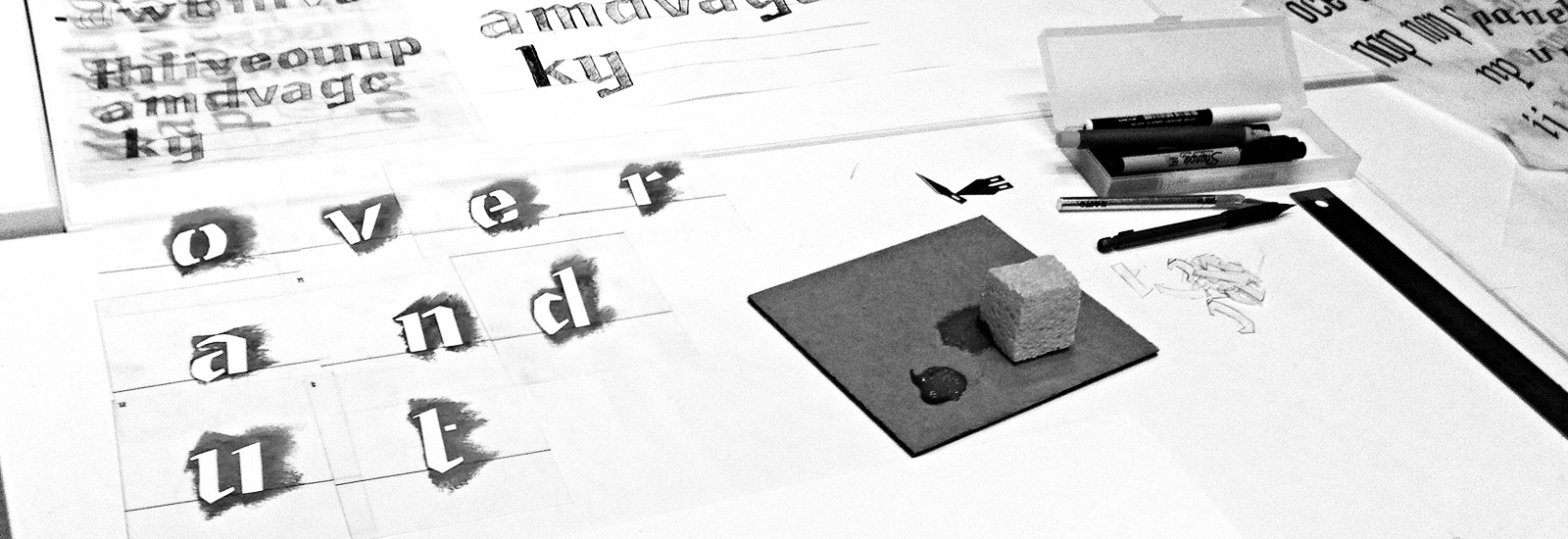
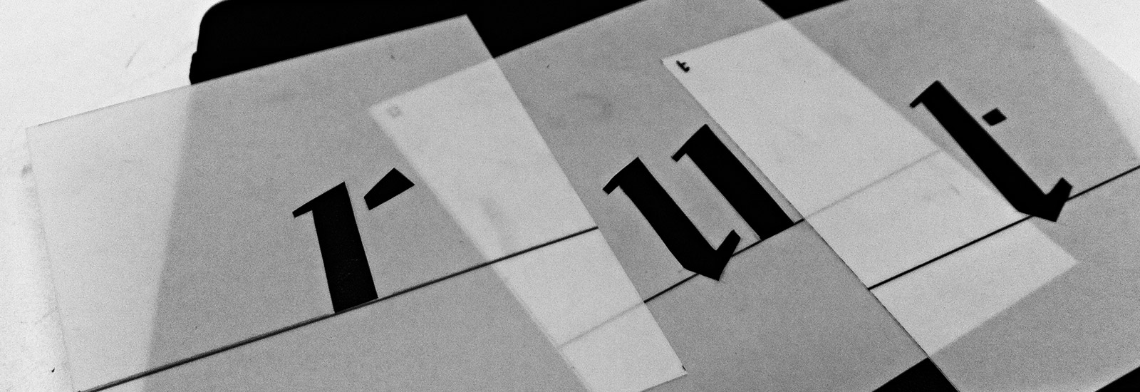
Workshop: Building Bridges with Ken Barber
In this stencil workshop we tackled some of the challenges of creating a formula for a complex typographic system. In other words we learned that stencils are simply the analog version of a digital font. All of the characters must work together in any order but retain a style without one character attracting more attention than another. We started drawing letters with a calligraphy marker as a base and from there we changed some features of the letterforms to give them a style. From there we worked on making everything cohesive and work together. Later, we scaled our letters up about 150% (easier to work with at a larger size) and added bridges to strengthen the forms and to preserve the counters when cutting them out.
I chose to add hard edges to my set of letters where ever the line changed direction. In the end I came up with something that to me called faintly to blackletter. Looking back I can see that this project was a precursor to my original typeface.