TERM 3
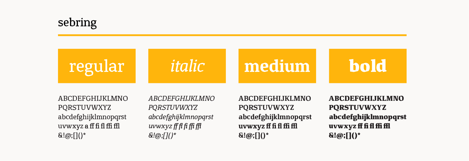
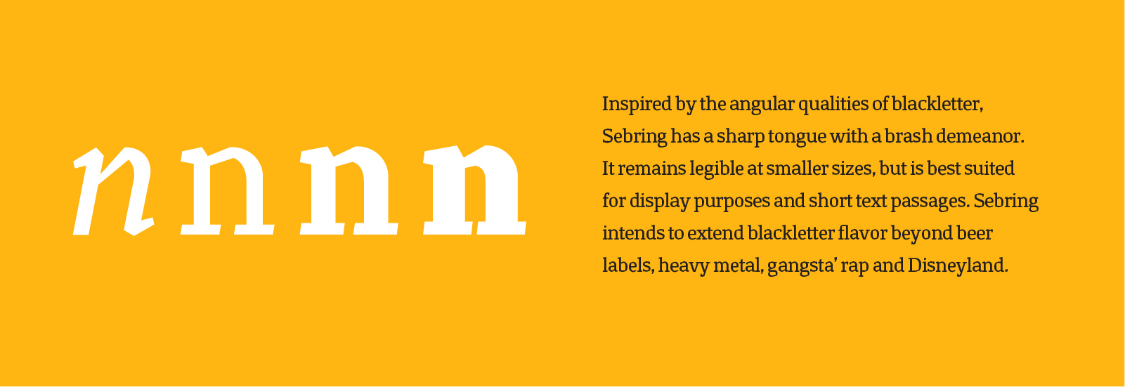
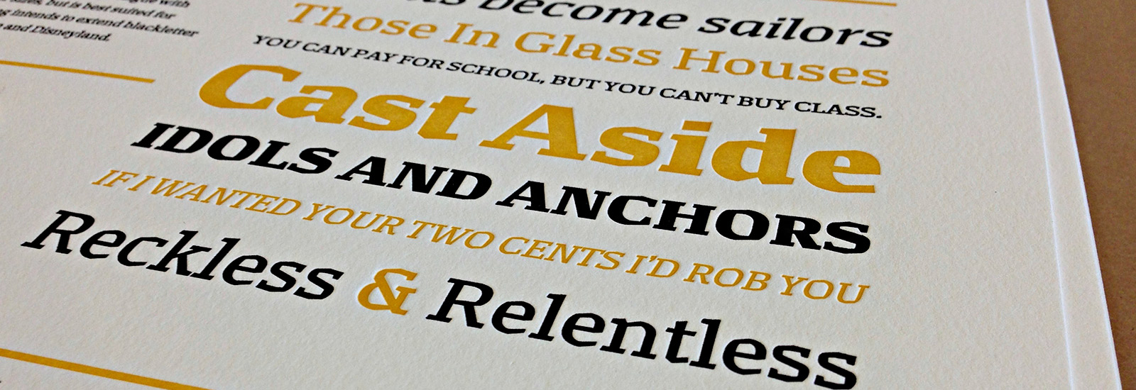
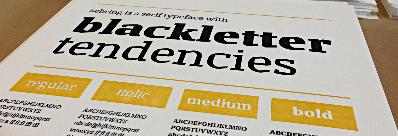
The Sebring Family
Third term we chose between pursuing our revival or our original typeface to move forward with and create additional styles and weights. Mostly everyone in my class went forward with their original, including me. We came to class with sketches of how we thought an italic and heavy or extra bold weight would look and went from there.
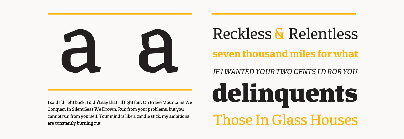
Bold: Even though we had spent an entire term drawing the regular weight, problems that might have gone unnoticed became very clear when we began making bold and heavy weights. Issues like spaces and counters closing up, and awkward tangents became new problems to solve in both weights. I often found myself redrawing letters a few times throughout the process and fixing little inconsistencies that came with looking too closely for too long. I had a lot of fun drawing the bold weight because features tend to get more exaggerated. Thicker areas get thicker quickly and the personality of the typeface really starts to show.
Italic: I never knew how italic styles were approached, I guess I always assumed they were redrawn from scratch. We learned a neat little trick where you make “fake italics” through rotating and skewing to bring you to a great starting point of what your oblique italic might look like. Then it’s up to you to go in and finesse everything, and probably make true italic forms rather then just oblique.
Medium: To get a medium weight I used Prepolator and an interpolation script. Interpolation is used to generate intermediate weights between two poles, usually a lighter weight and a heavier weight. Prepolator is a tool that compares two master drawings, making sure each letter has the same number of points, paths, path directions and names to maximize compatibility. I used my regular and bold master drawings to create a 50% interpolation, or Sebring Medium.
I still have a lot of work and reworking to do on Sebring before I even think of releasing it. I’d like to expand the character set and draw more weights.
Workshop: Font Production with Andy Clymer
Andy Clymer is a typeface designer and developer at Hoefler & Frere-Jones.
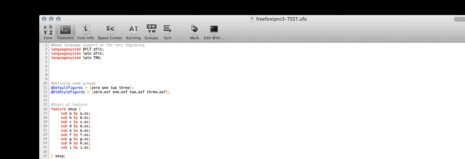
This was an 8 week course of the ins and outs of font production. Some topics that were covered were writing and testing OpenType features, using the RoboFab toolkit to build simple tools to automate repetitive tasks, getting naming and other font info tables set up the right way, and clearing up common bugs and error messages that inevitably come up during font production.
Having taken Ben Kiel’s Basic Python Programming workshop, I felt pretty confident jumping into this course. The first week or two covered the same basics as Ben’s class, but it was a nice refresher.
We spent a good amount of time learning about writing OpenType features such as ligatures, small caps, random cycles, and many more. Things like the importance of the order of which you write features, how to define groups, unicode values, and opentype feature support were also major topics covered. We also gathered a bunch of great resources like:
Opentype feature layout tag documentation
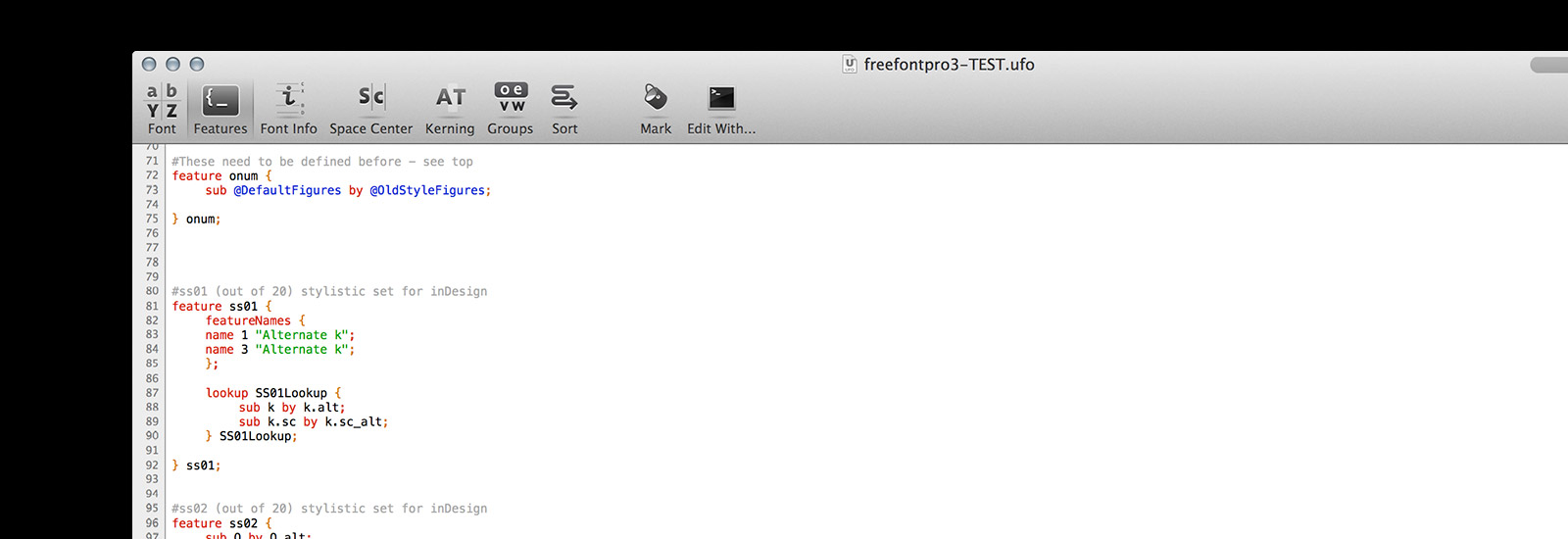
Hinting was the final topic covered where we learned all about overshoot zones, BlueValues, OtherBlues, FamilyBlues, FamilyOtherBlues, BlueFuzz, BlueShift, and BlueScale. The mantra for this session was: “No hints are better than bad hints”.
Hinting is the optimization of a truetype or postscript font for maximum readability on screen. Generally about 18pt is a good cut off to begin to look at hinting. Typefaces look great at high resolution and at larger sizes, but when reduced to smaller sizes on screen they are covered to smaller groups of pixels yielding distorted letterforms. This fine tuning was part of the reason why web was limited to only a handful of typefaces for the longest time.
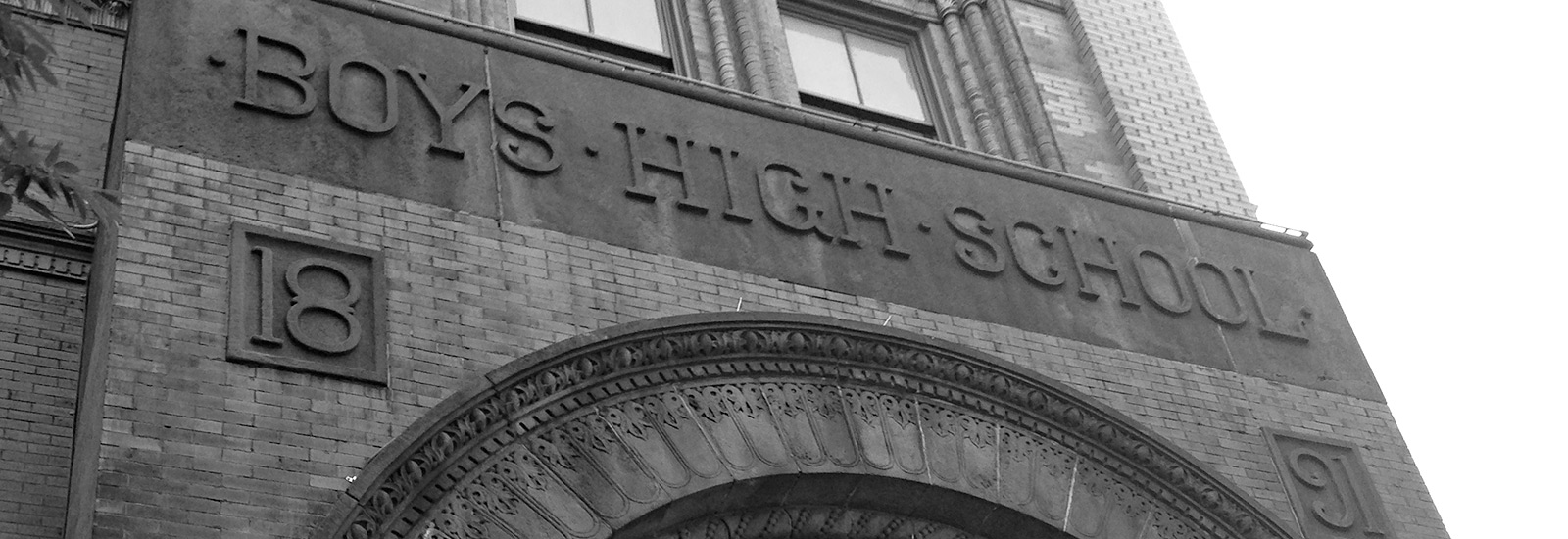
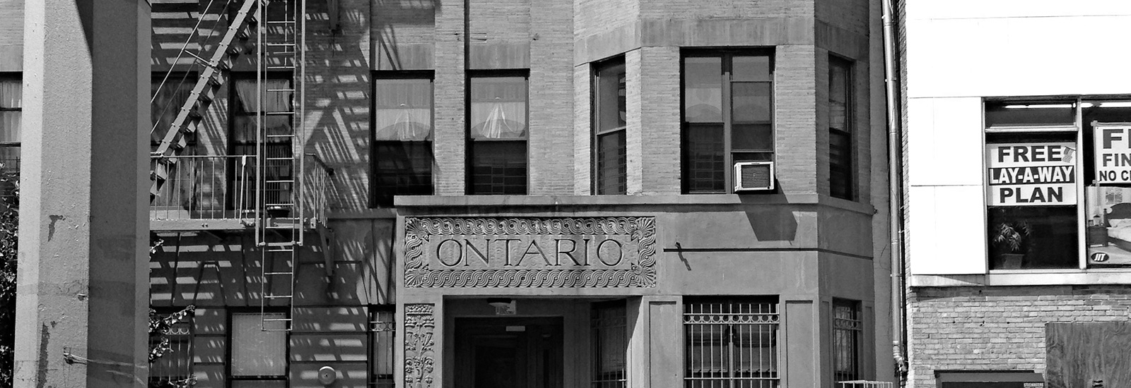
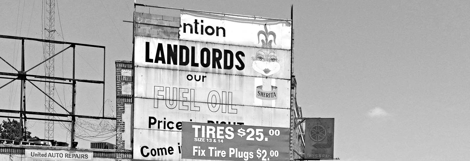
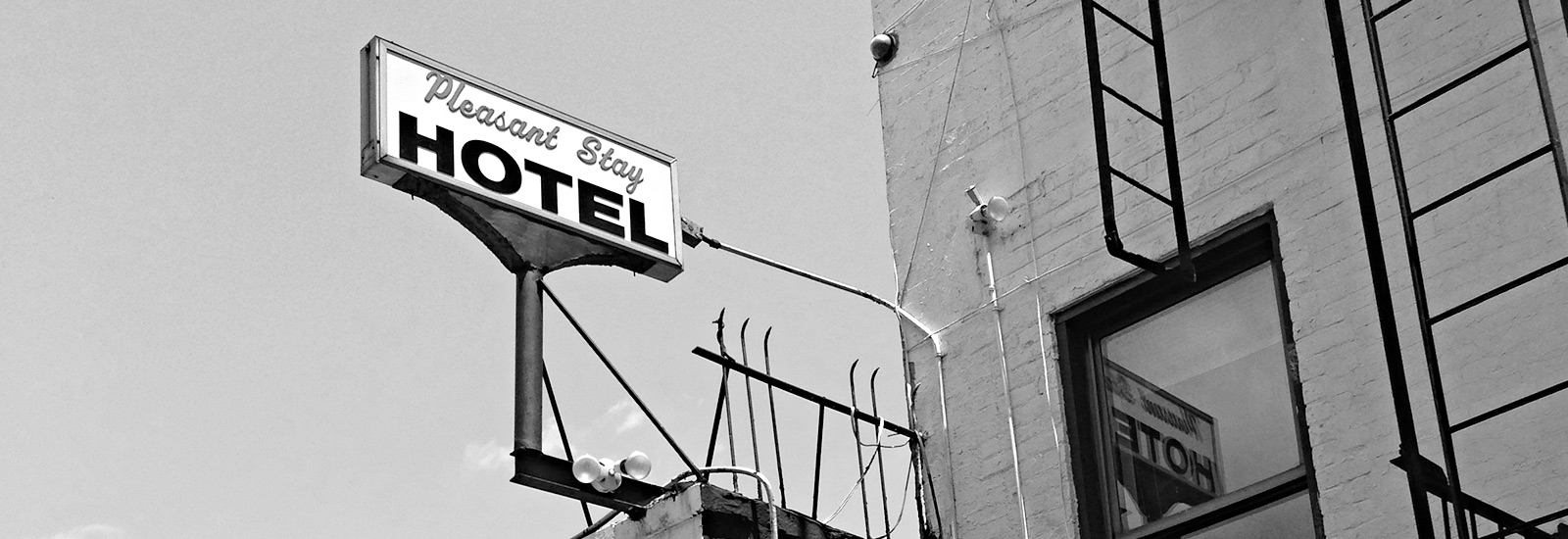
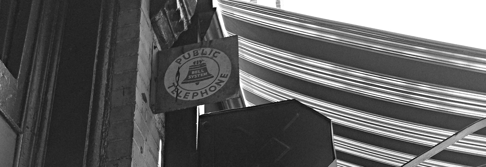
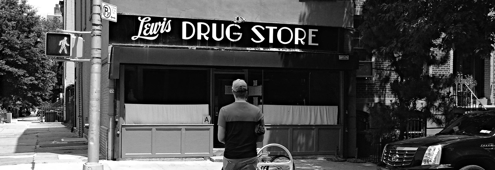
Type Walk In Brooklyn
In June we spent an afternoon in Brooklyn looking at old type and architecture. Our walk began in Fort Greene where Alexander Tochilovsky lead our group pointing out the hidden type gems he had discovered. We also walked through Clinton Hill, Bed-Stuy, Crown Heights and Stuyvesant Heights. For the most part you just had to look up to see great type on sides of buildings, signs, and awnings. Some of the more hidden type existed beneath awnings and at the bottoms iron support beams of buildings.
Having lived in Brooklyn for the past 4 years in 2 of the neighborhoods we walked through, it was exciting to discover some things that had been right in front of me the whole time. I now find myself looking around more diligently when I walk in search of more forgotten type.
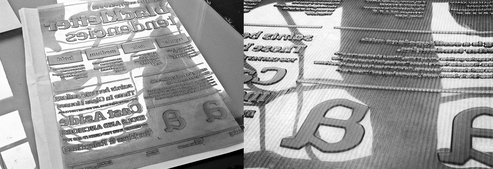
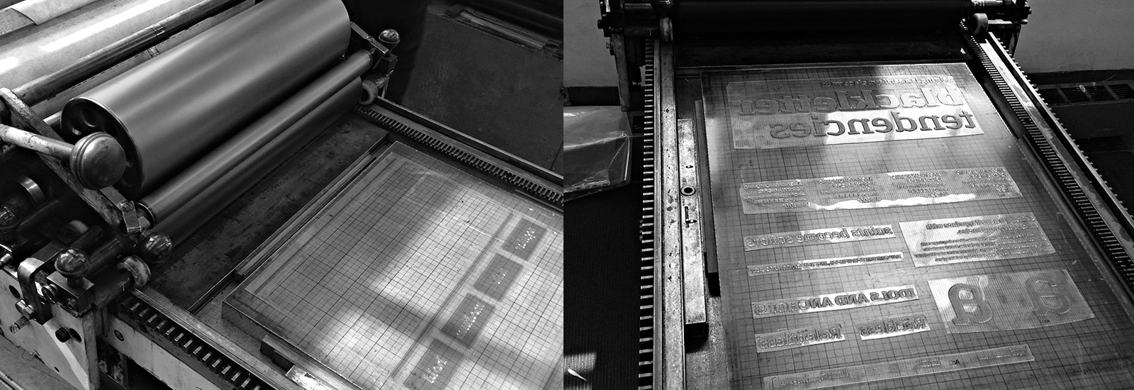
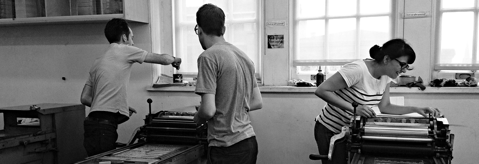
Workshop: Letterpress with Dan Morris
Dan Morris runs The Arm Letterpress in Brooklyn, NY and is a co-owner of The Dale Guild Type Foundry, one of the last producers of true metal foundry type.
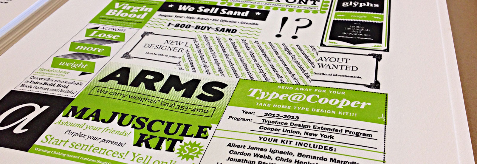
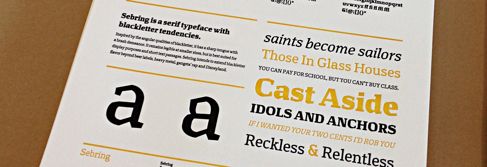
We spent some time during the third term coming up with a group poster concept to display the collection of our typefaces. We settled on the idea of a classified ad page. For this we each created some variation of 2 x 4 ad with content of our choice.
In the few weeks we had remaining, we each put together an individual specimen for our own typefaces. About a week prior to this workshop we sent out our files to Boxcar Press to get polymer plates made. The following weekend Dan taught us about mixing pantone colors, getting our plates lined up just right, and how to use the presses. We each printed 40 2-color type specimens, as well as taking turns printing our group poster.
Thank You
Thanks to: Cara Di Edwardo, Jesse Ragan, Alexander Tochilovsky, Andy Clymer, Isabel Urbina, Karolina Lach, Hannes Famira, Ken Barber, Sumner Stone, Ben Kiel, Karen Charatan, Dan Morris, Sara Soskolne, Christian Schwartz, Cyrus Highsmith, Just Van Rossum, and all of my classmates for all of your help!